Project
001
Mark
Flashcard focused app that is simple to use wrapped in a friendly interface that users of all ages can use.
A flashcard focused app designed to be not only interactive and fun to use, but also intuitive and user-friendly. With features that evoke playfulness and make learning a delightful experience. Mark is the perfect study buddy that helps you learn while having fun.
Details
002
Role
UX/UI Designer
Branding
Project Duration
2 Months
Tools
Figma
Procreate
Sticky Notes *lots of them
Overview
003
The Problem
There are many flashcard apps in the market, but not all have the interface to keep the users engaged enough. Some are confusing, while some have outdated interfaces.
The Goal
Create a flashcard app that is easy to use, intuitive and engaging for users to use.
User Interviews
004
“I want the app to be more fun to use.”
“I like Anki, but it isn’t fun to use”
“I personally don’t use flashcards because I like to see everything laid out.”
40%
of the interviewees claimed that using a flashcard app was their primary way of studying because of its convenience.
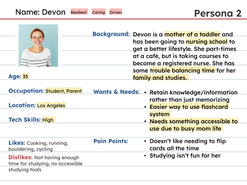
User Personas
005

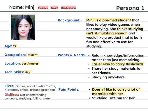


Minji: Likes video games, and needs
a certain level of mental stimulation.

Devon: Prioritizes convenience
and simplicity due to her busy life.
Comparative Analysis
006

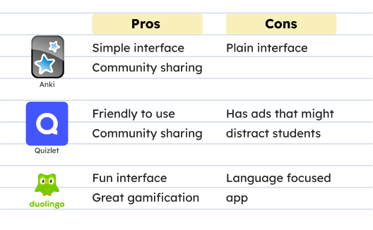
Key Takeaways:
- Focus on flashcard method
- Must be intuitive and easy to use
- Try and make it useful to those who like information laid out
- Inspiration will be taken from Duolingo for aesthetics and Anki for purpose
Logo & Branding
007
For the logo I wanted an iconic character as a logo to be more welcoming and establish the overall vibe of the app, which is friendly, welcoming and fun.


I came up with the logo by combining the concept of a smiley and a checkmark
After receiving feedback on the color combination of the outline and checkmark, I decided to go to a more muted, yet colorful version.


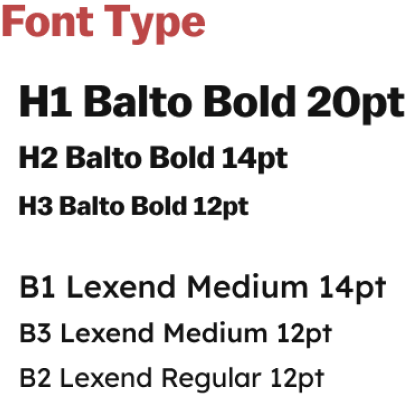
For fonts, I wanted fonts that were both legible and modern to cater to users. Since I knew the app would have a lot of colors, I didn’t want to overwhelm the users.
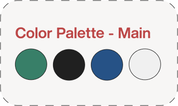
I wanted the app to be colorful but tastefully colorful. I decided to make the app plain and have color accents.


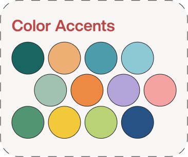
I went for a more eclectic array of accent colors to enhance the app. These colors were mainly used for the card/deck covers.

Mid Fidelity Wireframes
008

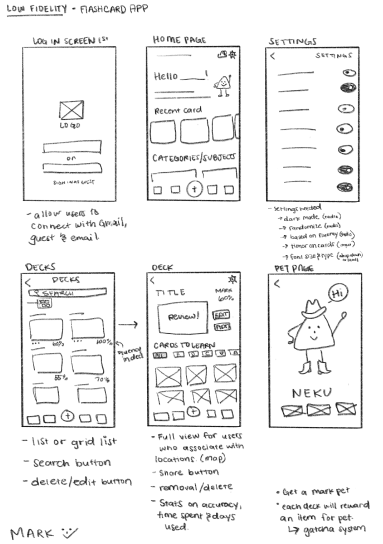
Low fidelity sketches
An easy to follow, simple and clean layout was my priority because my aim for the app is to be as intuitive as possible. This layout features horizontal and vertical scrolling.

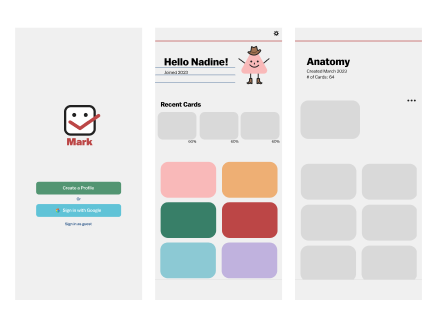
Mid-Fidelity wireframe of signup page and deck pages
The Results
009

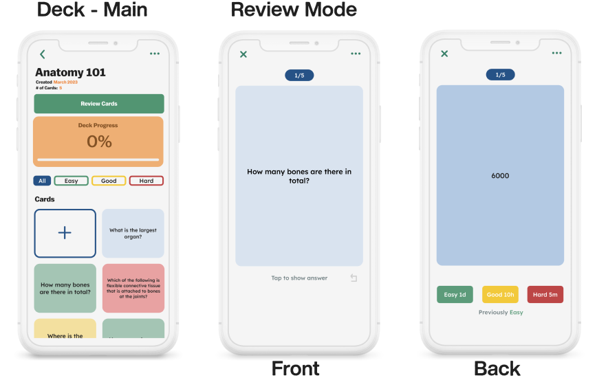

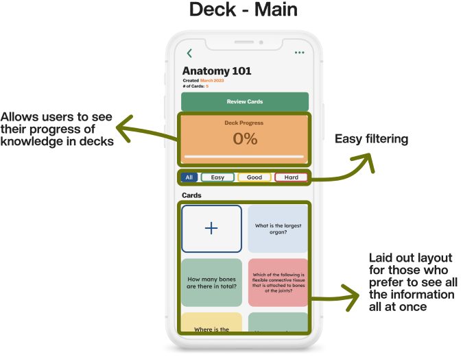

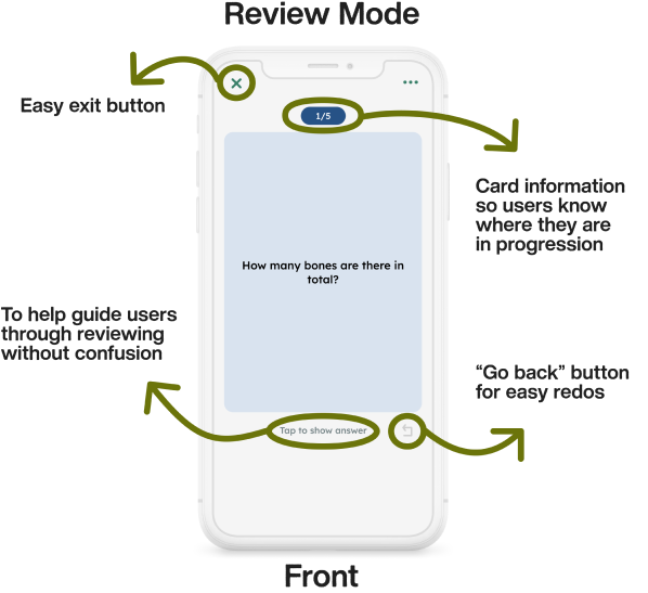
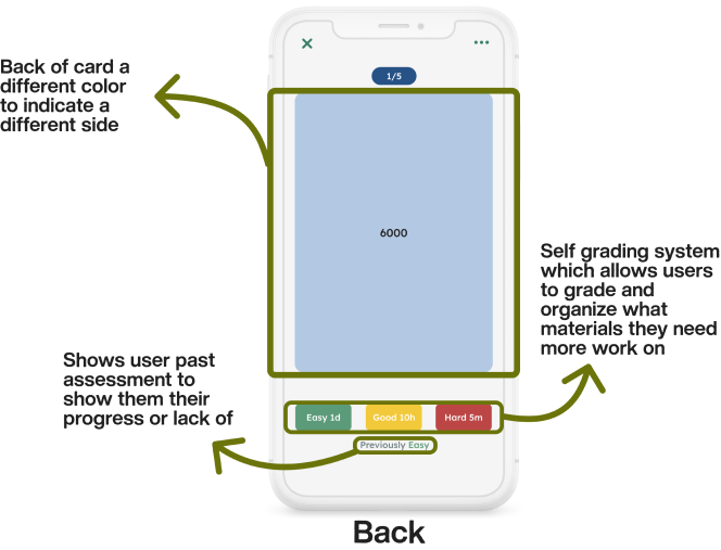
To make the reviewing process more straightforward, I added instructions to keep user flow, flowing.
After user testing, it was decided that the back needed to have a different color to give users an indication of a different side.